
Driving consumer VPN adoption through content strategy
Role: Content designer
Overview
Skills: Content design, user research, content strategy
Audience: Consumers (Microsoft 365 subscribers)
Tools: Figma, Microsoft 365 suite
Platforms: Windows, macOS, Android, iOS, web
Collaborators: 1 senior designer, 1 principal designer, 1 product manager, multiple engineers, 1 product marketing manager, legal
Problem
To stay competitive and help meet growth targets, the Microsoft Defender team decided to expand its offerings to include a VPN. However, early research also revealed that many customers were unclear about the value and use cases of VPNs, creating barriers to adoption.
Solution
We uncovered key knowledge gaps through research and designed step-by-step education within the experience. Clear, approachable messaging helped customers understand VPN benefits, making it easier for them to see the value and adopt the new feature with confidence.
Process
User research
Our first step was to partner with research to conduct multiple Rapid Iterative Testing and Evaluation (RITE) sessions. This research allowed us to test our designs early on, and adjust our approach based on user feedback. Some key takeaways were:
Most customers affiliated VPNs with security but were unsure how they worked.
Many customers were concerned about the security of public Wi-Fi.
Multiple customers had personal experiences with compromised personal info and identity theft.
I used this information to guide the messaging and gradually improve the content with each session.
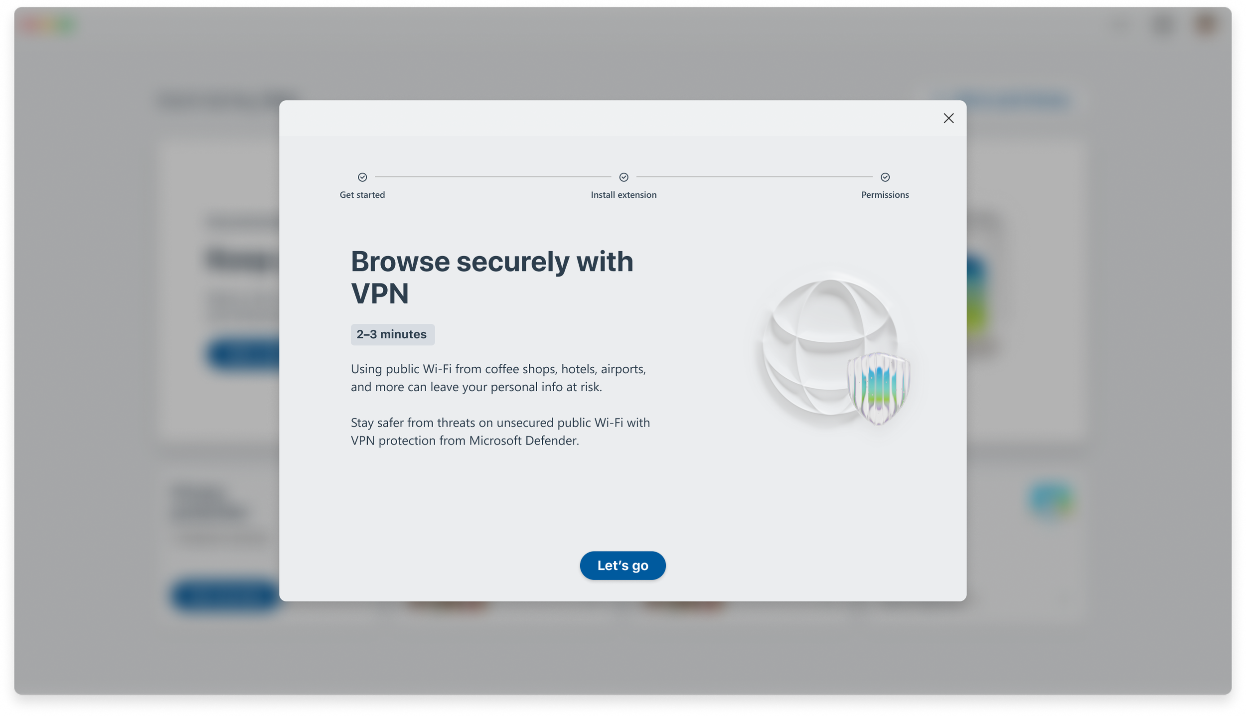
Before

Initial onboarding screen jumped into instruction too quickly and contained too much technical jargon. Also, the red illustration conveyed alarm, instead of reassurance.
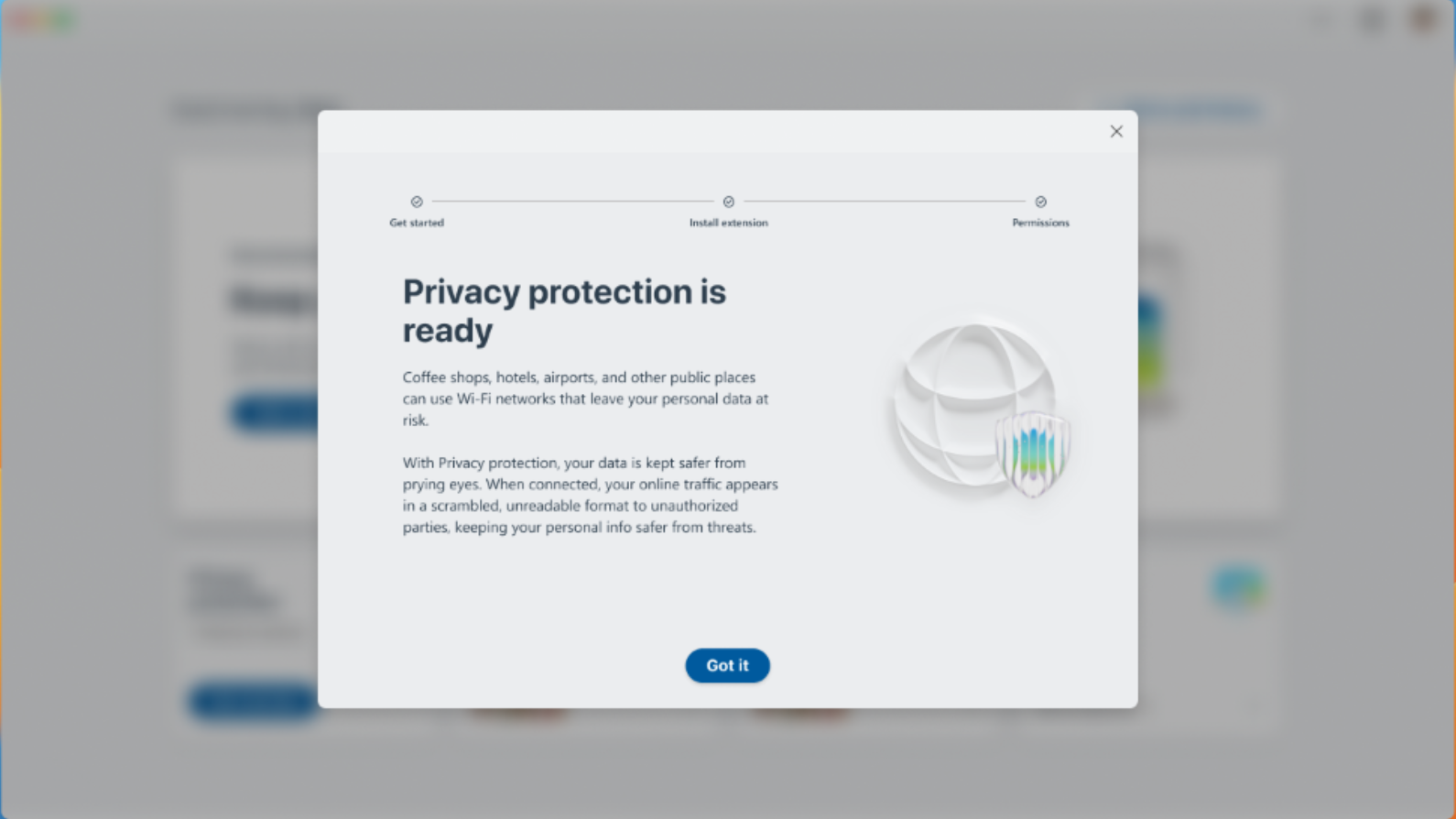
After
Final version focuses on staying safer on public Wi-Fi, which was a key user concern. I also recommended we swap out the illustration to convey protection and a more positive tone.
Content strategy
Throughout the research process, I also used our findings to develop the feature's content strategy and messaging guidelines. This includes:
Focusing on the benefits, such as peace of mind and additional online security.
Using progressive disclosure to present only the most relevant information at each step.
Prioritizing simple, clear language that avoids technical jargon and concepts.
I also continued to refine this strategy with A/B testing and additional research from our marketing partners.
Before
This final onboarding screen was too lengthly and communicated value propositions too late in the onboarding process.
After

Updated version clearly confirms successful set up and guides users on how to get started with the feature.
Beta feedback
After the initial design handoff, we continued to gather user feedback through beta testing of the app. I continued to adjust the messaging and made multiple updates to some of our in-app help content to address users’ common feedback and concerns.
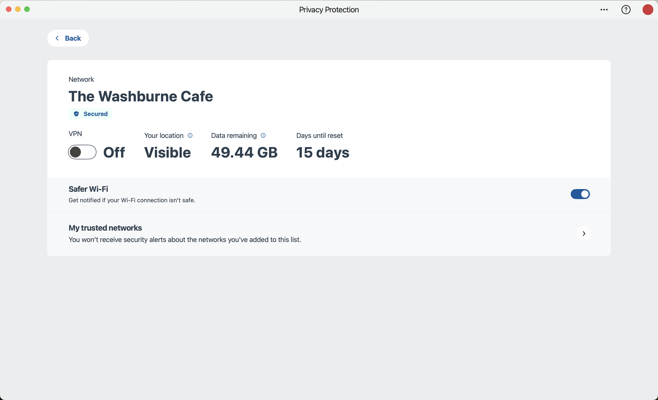
L1 screen clearly communicates essential information. Additional details are behind tooltips. Accessibility note: tooltip appears when selected (not on hover) making it easier for navigate for screen readers.
Results
This became Defender's fastest-growing feature and exceeded our growth goals. In addition, one push notification had a 6x higher clickthrough rate than average, which helped drive engagement with the feature.